


LineX White Icon Pack
JustNewDesigns
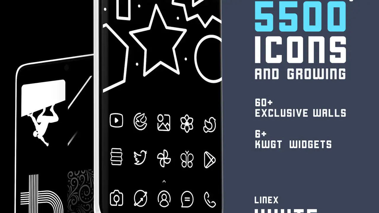
LineX White Icon Pack is the kind of personalization app I would consider when a phone feels visually busy and I want a cleaner home screen without changing the entire launcher experience. I spent time looking at it as a practical icon replacement rather than treating it like a simple collection of white drawings. Its appeal is very specific: a thin, bright, line-based look that can make colorful wallpapers and dark backgrounds feel more organized.
The app comes from JustNewDesigns and sits in the personalization category. It is listed at $0.99, with optional in-app purchases ranging from $0.49 to $5.99 per item. That makes it inexpensive to try, although the extra purchase path is worth noticing before you start customizing heavily. The app is rated for Everyone, works from Android 6.0 onward, and its current version is 7.9.
A closer look at the white line style
The central idea is easy to understand: replace ordinary launcher icons with white outlines in a consistent lineal style. In practice, that can change the mood of a phone more than I expected. Standard icons often use different colors, shapes, shadows, and visual weights. A white outline set removes much of that noise, so the wallpaper and widget layout become more important.
I found the style most convincing on a dark or moderately muted background. On black, charcoal, deep blue, or a subdued photograph, the white strokes are easy to see and the home screen feels deliberate. On a very pale wallpaper, the same icons can lose contrast. That is not a flaw unique to this pack; it is the basic trade-off of choosing white icons. If you regularly switch between bright and dark wallpapers, you may need to choose backgrounds more carefully than you would with multicolored icons.
The pack is also better suited to people who enjoy a restrained appearance than to users who want every app to retain its original branding. A familiar colorful logo can be identified instantly, while a thin white symbol may require a short pause. I adjusted to that quickly for the apps I open every day, but less frequently used apps were not always as obvious at a glance.
Related News

Why WhatsApp Messenger Still Makes Everyday Communication Feel Easy

Jurassic World: The Game Is the Better Dino Tycoon for Strategic Players

Threads in Real Life: Who Should Join, Lurk, or Leave

How SHEIN Turned Shopping Into an Endless Content Feed

How to Make Fortnite Feel Smarter on Mobile

Should You Switch to Microsoft Outlook on Mobile?
The strongest result comes from treating the icon pack as part of a complete layout, not as an isolated download. A dark wallpaper, limited widget colors, and a tidy grid help the white line work stand out. If the rest of the screen remains highly colorful, the icons may look clean individually but less cohesive as a group.
What the installation decision really involves
Because this is an icon pack, the first question is not simply whether the artwork looks good. The more important question is whether your launcher can apply icon packs in the way you expect. Android phones do not all handle third-party icon packs identically. Some launchers offer a direct icon-pack selector, while others rely on a separate customization layer or support only certain replacement methods.
I would check the launcher settings before paying or rearranging a home screen. Look for an appearance, theme, or icon option and see whether external packs are supported. This small check can save frustration, especially if you use a manufacturer launcher with limited personalization. The pack itself cannot make an unsupported launcher behave like a fully customizable one.
Gallery
Once the pack is applied, I recommend starting with the main home screen rather than changing every page immediately. Replace the icons you see most often, then live with the result for a day. This reveals whether the thin white shapes remain readable during normal use, including in bright daylight and when you are moving quickly between apps.
That gradual approach is useful because icon replacement changes muscle memory. I rely on position for many apps, but I also recognize color and brand shape. A white line design removes those color cues. Applying it selectively at first lets you discover whether the cleaner appearance is worth the small recognition cost.
Who will get the most from it
I think LineX White Icon Pack is a particularly good match for someone who has already chosen a minimalist launcher layout. It works well for a monochrome setup, a dark-themed phone, or a home screen built around a large photograph where bright, simple outlines can sit above the image without competing with it.
It is also useful for people who dislike the visual inconsistency created by mixing icons from different developers. Even when individual app icons are attractive, they rarely share the same proportions. A unified white treatment can make a collection of unrelated apps feel like one system.
Another good use is a secondary home screen designed for focus. I like the idea of keeping the first page limited to essential tools and using the icon pack there, while leaving a more conventional arrangement elsewhere. That gives the phone a calmer entry point without forcing every app into the same visual language.
On the other hand, I would not recommend it as the first choice for someone who depends heavily on instant color recognition. If you distinguish a banking app, messaging app, or work tool mainly by its original colors, the switch may slow you down. Users who prefer animated, three-dimensional, highly detailed, or colorful icon designs should also look elsewhere; this pack is intentionally restrained.
Everyday use: a realistic home-screen routine
Imagine checking your phone during a busy morning. Your wallpaper is a dark city photograph, the first page contains a calendar widget, a weather widget, and only the apps you use before leaving home. With the white line icons applied, the screen has a clear hierarchy: the widgets provide information, the wallpaper supplies atmosphere, and the icons act as quiet controls.
That arrangement is where the pack makes practical sense. It does not add a new productivity system, but it can reduce the visual competition between unrelated app logos. I found that useful when I wanted the home screen to feel less like a crowded app drawer and more like a small dashboard.
The trade-off appears when the day becomes less predictable. If I needed to open an infrequently used app quickly, a colorful original icon would often be easier to locate. A good compromise is to keep the first page minimal and use a more familiar arrangement on later pages. You can also group less-used apps into folders, where the consistent white treatment is less demanding than a full page of individual icons.
Another practical tip is to avoid placing similar-looking shortcuts beside one another during the first setup. White outlines can make neighboring symbols feel more alike than their original versions. Spacing, folders, and position become more important, so a little rearrangement can improve usability more than adding more widgets.
Customization choices and the limits of control
The value of an icon pack depends partly on how much control your launcher gives you after installation. I would not assume that applying the pack automatically produces a perfect result across every app. A launcher may leave some icons unchanged, use a generic substitute, or require manual handling for shortcuts that are not recognized.
That is one of the less obvious realities of third-party icon packs: visual consistency is partly a partnership between the artwork and the launcher. Before judging the design, I would inspect the home screen for missing or mismatched icons. If only a few apps look out of place, manual replacement or a folder-based layout may be enough. If many important apps remain unchanged, the limitation is likely to be the launcher’s compatibility rather than the pack’s overall style.
I also recommend keeping a note of your original arrangement before experimenting. Icon customization is easy to start and surprisingly tedious to undo when several pages, folders, and shortcuts are involved. A simple screenshot of each page gives you a practical fallback. This is especially helpful if you are testing the pack alongside another visual theme.
For users who change wallpapers often, the white design creates a clear decision point. Dark wallpapers make the icons readable, while light images may force you to add contrast through a shadowed area, a darker crop, or a simpler background. If your wallpaper is the main reason you customize your phone, choose the image after applying the icons rather than before. The pack looks more intentional when the background supports it.
Trust, visible choices, and responsible expectations
When I review a personalization app, I also consider how much control the user can see during installation and use. This type of tool should be approached with the same care as any app that changes the appearance of a personal device. I would read the permission prompts, payment screens, and launcher settings instead of approving everything automatically.
The clearest user-controlled decisions here are practical ones: whether to install the pack, whether to pay the listed price, whether to make optional purchases, whether to apply it through a compatible launcher, and whether to keep using it after testing. Those choices are separate from one another, which is useful. You do not need to commit your entire home screen simply because you want to inspect the visual style.
I would also pay attention to any account or purchase screen shown on your device and make sure the selected payment option is the one you intend to use. The optional items have their own prices, so it is sensible to review each purchase rather than treating the initial low cost as the total possible spend.
For privacy-conscious users, the right habit is to inspect the app’s current permission requests and the privacy information presented in the store or during setup. I would not infer a privacy advantage merely from the fact that the app changes icons, and I would not grant access that does not make sense for the task. Keeping the review focused on visible prompts and choices is more reliable than guessing about background behavior.
The app’s Everyone content rating makes it approachable for a broad audience, but that rating should not be confused with a guarantee that every phone will offer the same installation flow. The operating system version and launcher remain important. Since Android 6.0 is the minimum supported system, older phones that cannot meet that requirement are not suitable, while newer phones may still differ in how they expose icon customization.
How it compares with ordinary icon options
The usual alternative is to keep the launcher’s default icons. That is the simplest route and usually the most predictable. You retain color recognition, avoid compatibility checks, and do not need to spend time rebuilding the home screen. If you value convenience above visual consistency, the default set is probably better.
Another alternative is a colorful themed pack. Those packs can make apps easier to recognize and may provide a stronger decorative effect. The white line approach is quieter: it asks the wallpaper and layout to do more of the visual work. I prefer it when I want the phone to look calm rather than expressive.
System-wide monochrome or themed-icon tools can be more convenient on supported devices because they may affect icons without requiring a separate pack. However, they may not offer the same specific line-art character. LineX White Icon Pack makes more sense when you want this particular white-outline identity and your launcher supports it cleanly.
Manual icon replacement is the most flexible alternative, but it is also the most labor-intensive. You can choose individual images and preserve original icons for apps where recognition matters. The downside is that achieving a consistent result takes patience. A dedicated pack is more efficient if you want a unified look across a large group of shortcuts.
Cost, support window, and long-term practicality
The app costs $0.99, which I consider a modest entry point for a focused visual change. The optional in-app purchases, priced from $0.49 to $5.99 per item, mean I would still review the purchase screen carefully before adding anything beyond the initial download. The low starting cost makes experimentation easier, but the real value depends on how often you keep a customized home screen.
JustNewDesigns released the app on Apr 24, 2019, and the current version is 7.9. Those details matter less than the day-to-day result, but they are useful context when deciding whether a design fits your phone today. Android launchers and manufacturer interfaces change over time, so I would test the current experience on your own device rather than assuming that an older customization workflow will behave exactly the same everywhere.
The app has passed 50K installs and holds a 4.5 average from around 772 ratings, with 48 written reviews. I see that as encouraging evidence that the concept has found an audience, but not as a substitute for checking launcher compatibility. A well-liked icon style can still be a poor fit if your particular home-screen software does not apply it properly.
My cautious recommendation
After weighing the appearance against the setup trade-offs, I would recommend LineX White Icon Pack to Android users who specifically want white outline icons and are willing to spend a few minutes arranging the result. The design has a clear identity, and it can make a dark, carefully planned home screen feel much more coherent than a mixture of unrelated app logos.
I would skip it if you want instant recognition from original app colors, use a launcher with weak third-party icon support, or regularly choose very bright wallpapers. In those situations, default icons, a system theme, or a more colorful pack may be the more comfortable option.
My best advice is to treat the purchase as a visual experiment rather than a permanent commitment. Check your launcher first, read the visible prompts, apply the pack to a small set of important apps, and test the layout in both bright and dim conditions. If the icons remain readable and you enjoy the calmer screen, the low entry price is easy to justify. If you find yourself hunting for familiar apps, the cleaner appearance is not compensating for the lost convenience.
In short, LineX White Icon Pack is a focused personalization choice rather than an all-purpose makeover. Its success depends on contrast, launcher support, and your willingness to trade colorful recognition for a consistent white line style. For the right setup, that trade is worthwhile; for everyone else, the ordinary alternatives may be more practical.
FAQs for LineX White Icon Pack
What is LineX White Icon Pack?
LineX White Icon Pack is a customization app for Android devices that replaces standard app icons with a consistent white, outlined design. After installing it, you can apply the icon theme through supported launchers and give your home screen a cleaner, more modern appearance. It is designed for users who enjoy minimalist layouts and want their icons to match a monochrome or light-colored wallpaper.
Which launchers are compatible with LineX White Icon Pack?
Compatibility depends on the launcher installed on your Android phone or tablet. LineX White Icon Pack generally works with many popular third-party launchers that support icon packs, including launchers such as Nova, Lawnchair, Smart Launcher, Microsoft Launcher, and others. The exact experience can vary, so you may need to apply the pack from the launcher’s icon settings or use the icon pack’s built-in apply option.
Does LineX White Icon Pack include icons for every application?
The pack covers a large selection of commonly used applications, but no icon pack can guarantee an icon for every app available on Android. If an application is not supported, the launcher may display its original icon or allow you to select a similar replacement manually. Before downloading, check the pack’s description and preview images to confirm that your most frequently used apps are included.
Can I request new or missing icons in LineX White Icon Pack?
Many icon pack developers provide an icon request feature so users can ask for designs for unsupported applications. If LineX White Icon Pack offers this option, you can usually submit requests through the app’s dashboard, support section, or linked contact page. Requests may not be completed immediately, and the developer may prioritize popular apps or include new icons in future updates.
Is LineX White Icon Pack free to use, and does it affect phone performance?
The availability and pricing of LineX White Icon Pack may depend on the version listed in the app store, so review the current download page for purchase details and any in-app requirements. Applying an icon pack normally has little effect on performance because it mainly changes launcher graphics. However, launchers with extensive animations, widgets, or live wallpapers can use additional battery and memory.
Pros
- Clean white icons create a consistent
- minimalist home-screen style.
- Large icon library covers many popular Android apps.
- Frequent updates can add support for newly released applications.
- Includes matching wallpapers for a more complete visual setup.
- Works with several popular third-party Android launchers.
Cons
- Some less common apps may still use the default icon.
- Requires a compatible launcher and may not work on every device.
- The bright white design can reduce visibility on light wallpapers.
- Icon requests may take time before unsupported apps are added.
- Customization options are more limited than full theme launchers.


